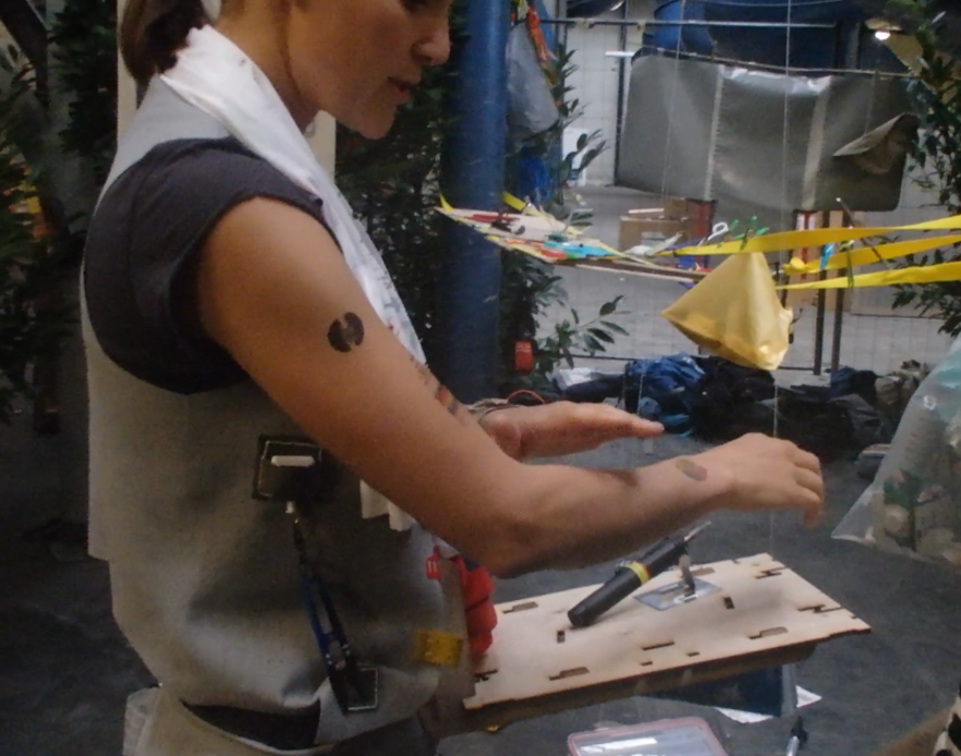
After exploring three practitioners, I decided to design a probe with regard to painting. Similar to Zi Lin, I was also inspired by the recent news of NUS undergraduate who made tools for the visually impaired to cook.
Since painting is such a visual activity, I keen to invent a tool to make it more accessible to the visually impaired. During my practitioner observation, my friend always made sure to mix all her paints first. She was able to easily pick out the paint tubes she needed, and squeeze the right amount of paint before swatching them to test. This task might seem simple, but to a blind person, it could be of utmost difficulty. Hence, I looked into producing a color mixing kit.
Contents + Rationale
In order to make it easier for the visually impaired to identify the color of individual paint tubes, I wanted to label the tubes with braille. However, for obvious reasons (1. I don’t know braille 2. I don’t know people who read braille), I decided to use a embossing tool to label the tubes. Ideally, however, the tubes would be labelled with both the letters and braille.
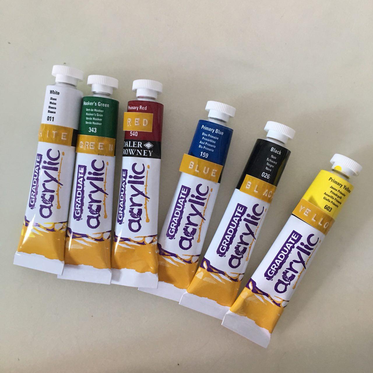
Fully labeled set! 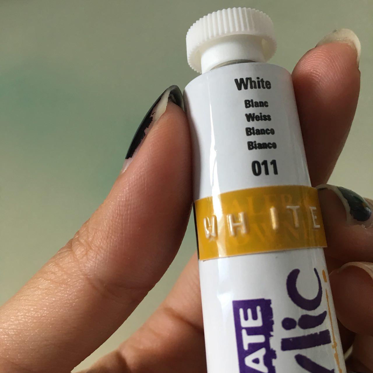
Embossing tool enables the label to ‘stand out’.
This made the labels more textured and would allow for people to read it, whether or not they knew how to read braille. By running your fingers over the labels, you could make out what word it was.
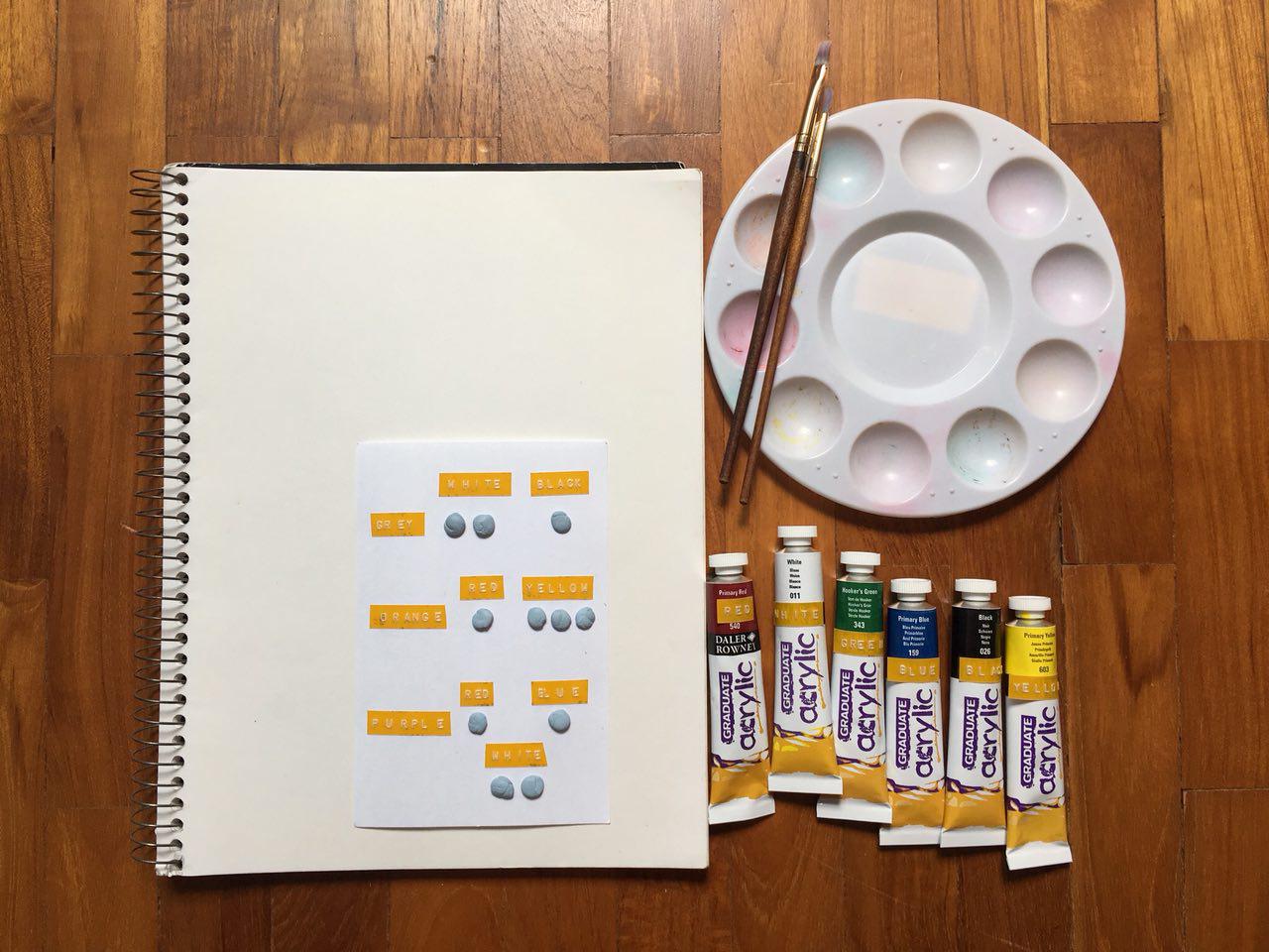
As mentioned previously, mixing paints is an integral part of the painting process. However, if one is blind or visually impaired, they may find it difficult to tell how much paint they need for a certain color. Hence, I came up with a color recipe card that uses the same concept as the labeling of tubes to guide painters in mixing their paints.
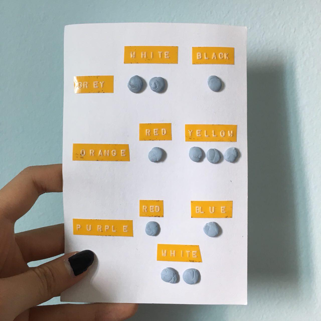
For example, in order to mix grey, you need two parts white to one part black.
Once more, this would ideally be labeled with braille as well! Following this recipe card, the painter would be able to know the proportions of paint to use in order to make the necessary color.
Accompanying my kit, is this instruction card.
Experience with Probes
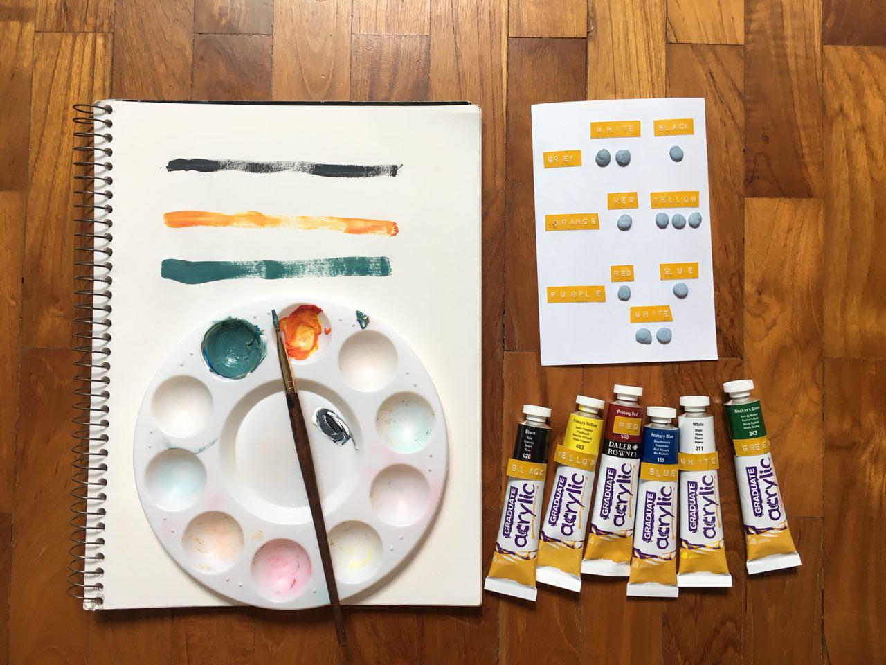
Unfortunately, I was unable to meet up with the original practitioner to get her to test out my kit. However, I did get other people to try it out! Here are some of my findings.
1) Describe your overall experience in mixing paints blind.
- “Immediately felt ‘crippled’, totally not used to painting without sight! I felt a lot of hesitation.”
- “I thought that it was going to be a lot messier, but I think I did pretty well. At least the paint ended up on the palette and the colors look alright.”
2) Were the raised labels and recipe card useful to you?
- “I liked the idea of having a ‘recipe card’. The proportions helped me estimate how much paint I needed from each tube to produce the correct color. But it was hard to gauge how much I was squeezing out from the tube since I couldn’t see – I can only gauge from my strength.”
- “The labels helped, but definitely took a lot of time and focus in feeling around it to figure out what color the tube of paint was. I had to touch and feel each and every tube at least twice before I was confident that they were the colors I needed.”
- “The recipe card was useful, but I think I spent a lot of time on it. I think it would be better if there was a line separating the ‘resulting color’ (i.e purple, orange, grey) from the ‘recipe’. Because after awhile, I wasn’t sure what I was feeling anymore. Had to use a lot of brain power!!! But I can see how braille or embossed tubes of paint would help with visually impaired people.”
3) What difficulties did you face in completing the task?
- “Squeezing all the paint into the same place on the palette and mixing them together!”
- “Gauging whether or not my ‘units’ of paint were equal. For example, I had to use one part red, one part blue and two parts white to produce purple. But I think my one part red was bigger than my one part of blue, and my white was definitely not two parts. So the resulting colour was super off.”
Personal Thoughts
Creating this kit was incredibly fun, and it was exciting to see the different responses from the people who used my kit! I think it’s difficult to try and control subjective factors such as how much ‘one part’ or ‘two part’ of paints means to each person – as it differs from person to person. Perhaps this is something that can be looked into, or left to the individual’s intuition. I was also thinking of a similar recipe card to aid those with color blindness. Granted, the card would not need to be textured as color blind people can still see. However, it could showcase different colors, along with verbal descriptions, so that color blind artists can learn to recognize the subtleties in the different hues and shades of color. And if they don’t know what color something is, they would be able to match it to the color recipe card to figure it out. Different types of color blindness would also warrant different types of color recipe cards, but perhaps it could reduce the amount of second-guessing color blind artists have to do.
